


Stephanie Zellhoefer
“[They were] absolutely terrific, my team and my clients were equally impressed. I would definitely recommend them to my friends and colleagues. 10/10.”

Fiona O' Shaughnessy
Micepad creates a more refined user experience for our senior leader events. They appreciate the ability to find the information they need immediately. It has also helped us deliver some of the key parts of the events such as capturing brainstorming sessions and outcomes.

Kelvin Ip
Our Annual Conference was a great success, Micepad was committed to meet our requirement and provide engaging conferencing experience. Last but not least, top notch customer service from the team!

Emily Lee
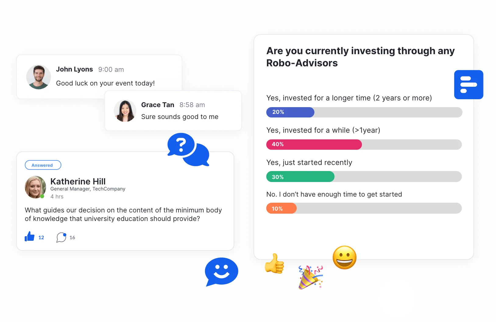
The easy-to-understand and user-friendly questionnaire design allowed us to repeatedly reach the highest achievement rates and attract customers to participate in the event!
With Micepad, what else would we need?!

Diana Ng
We enjoy working with Micepad's team, who respond quickly to requests and follow up with the aim of resolving issues. There is nothing else we could ask for.

Kenneth Lou
Micepad is an easy to use intuitive platform that allows users to engage with a large chunk of content in a very seamless way

Issac Yong
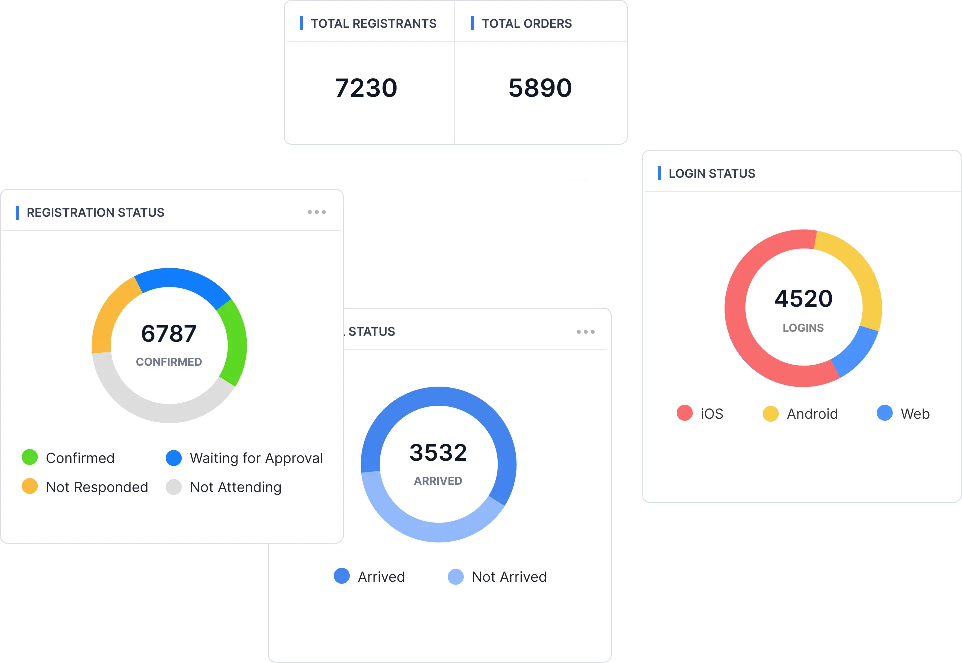
Micepad has outdone itself yet again. We had asked for more data reporting and a better word cloud projector and they really did make it happen.